

PROJECT CONTEXT & PREMISE
MENTORSHIP is a desktop application which promotes conversation and peer learning between colleagues. It exists to enable people within the workplace to connect, share skills, gain knowledge and create relationships, no matter their job title or geographical location.
It can be used to create a sense of company community outside of internal teams, helps with individual career progression and builds self and social confidence within the user.
UX CHALLENGES
1. FUNCTIONALITY - How will it work?
Design a system that connects people with each other.
2. ENJOYABILITY - What will make people want to use it?
Design a social application that will delight the user and not feel too clinical or impersonal.
3. SUSTAINABILITY - Why will the user want to keep using it?
Add design elements that will make the user motivated to come back to use the application time again.
UX SOLUTIONS
1. FUNCTIONALITY
To begin, each user registers with the application. They then create a unique profile and list the skills that they would like to learn or teach on their profile using a tag based system. These skills can be either career related or recreational, as the application is designed to be used in an informal and self-motivated way.
An algorithm then pairs two people together based on corresponding tags. From here the users can then continue the conversation using an internal chatroom system. This allows for them to communicate without clogging up work email accounts and keeps a nice separation between daily work and private conversation.
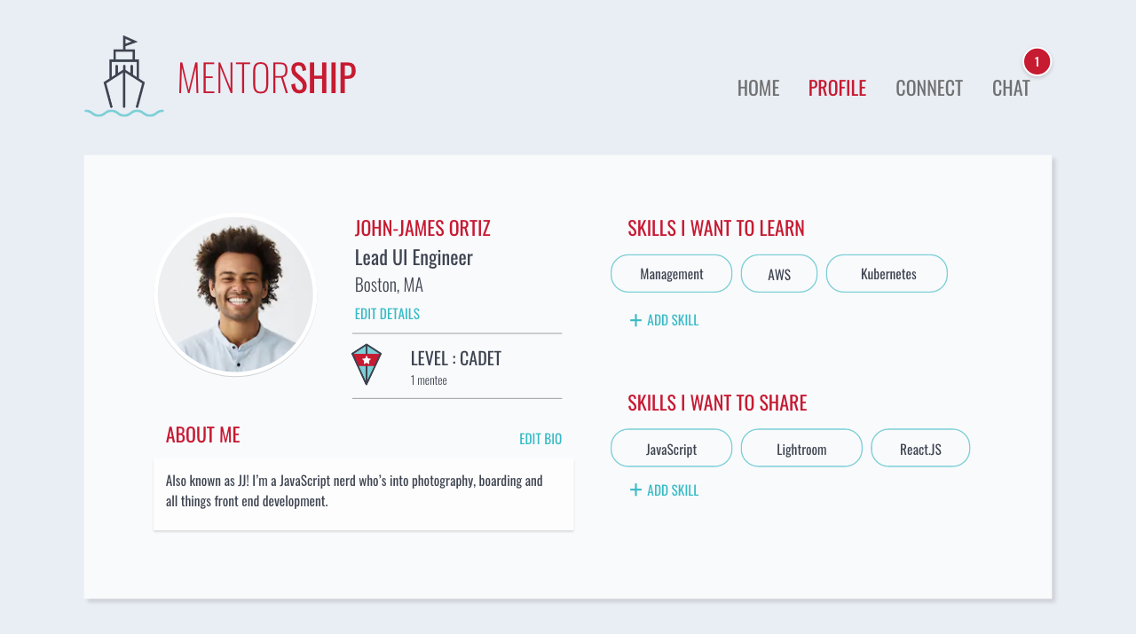
FILLED PROFILE SCREEN
TAG APPEARANCE
A challenge I faced was managing how the skill tags would appear on the user's profile. The amount of tags that can be entered are infinite, and therefore could look and feel overwhelming on screen. To add skills, I employed a system in which once the "add skill" CTA is triggered, an input field appears for the user to write in a skill. Skills are saved by pressing the enter key.
For scenarios where more than 5 tags are listed, I added an accordion feature that allows the user to view all of their tags or a few, without compromising the profile page layout. The 5 that are shown could be the most searched for or popular tags across the platform or potentially the user could "Pin" the 5 subjects that they are most interested in learning or teaching, to this area.
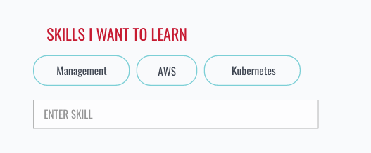
INPUT FIELD APPEARS ONCE "ADD SKILL" CTA IS TAPPED
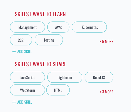
MULTIPLE SKILL TAGS VIEW
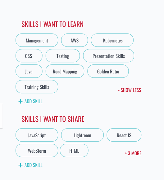
EXPANDED MULTIPLE SKILL TAGS VIEW
LOGIN / REGISTRATION
The user can log into the application either via the inline login form located on the main homepage or via a link which takes you to a dedicated login screen. For continuity I used the split screen look and feel of the dedicated login form across the registration and email verification pages also, playing with colour to highlight the different page purposes. I included loading states to give the user feedback and satisfaction throughout the experience.

LANDING PAGE - LOGIN
LANDING PAGE - AFTER LOGIN
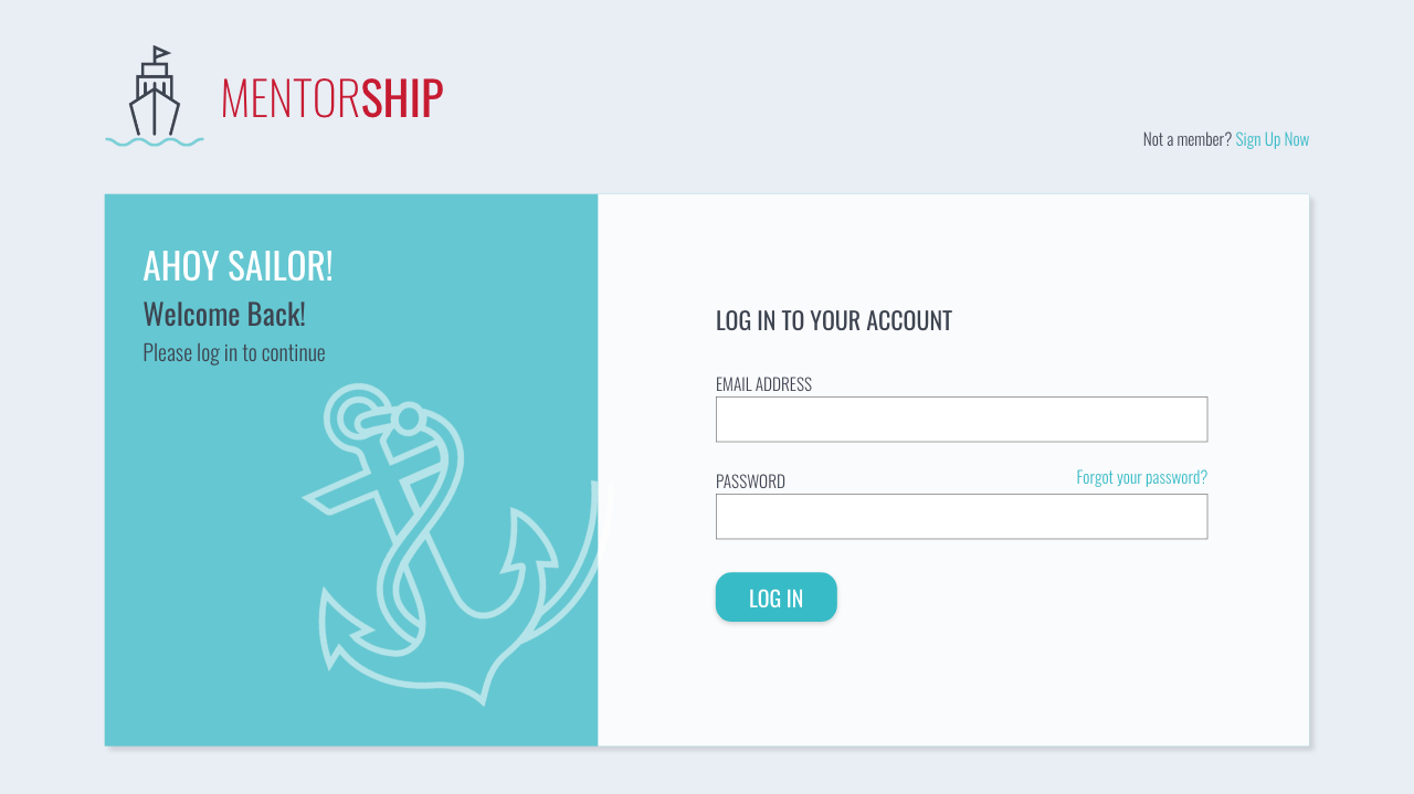
DEDICATED LOGIN SCREEN
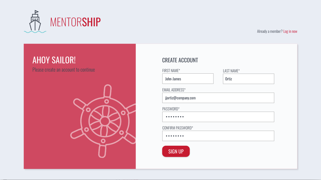
DEDICATED REGISTRATION SCREEN
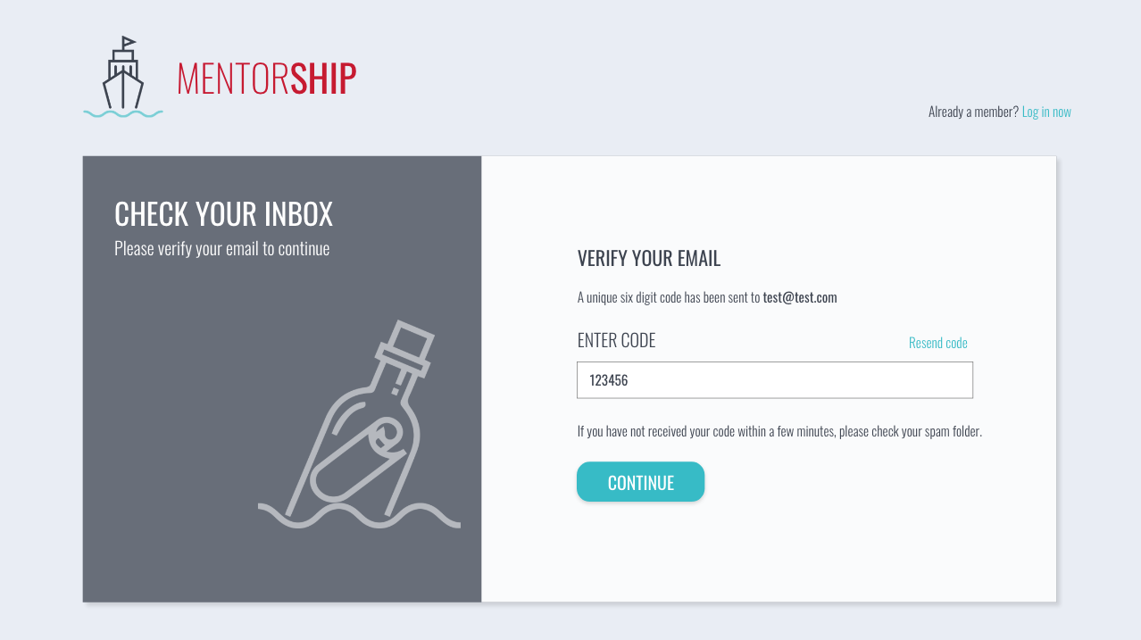
EMAIL VERIFICATION SCREEN
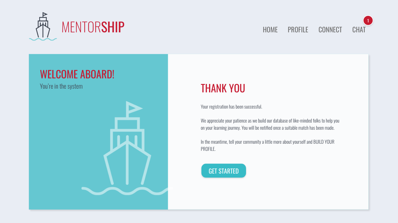
REGISTRATION COMPLETE SCREEN
REGISTRATION PROCESS
2. ENJOYABILITY
FUN AND FAMILIAR DESIGN
In the design of the overall aesthetics and methodology I took inspiration from a variety of widely used social media applications such as Facebook, Messenger and Tinder, to provide a familiar atmosphere for the user. The user demographic is varied yet mainly centred around young professionals aged 21- 35, so I wanted to keep the layout and colours fresh and fun. I also incorporated nautical themed illustration and terminology, creating a playful and cohesive environment and one that is non threatening and inviting.
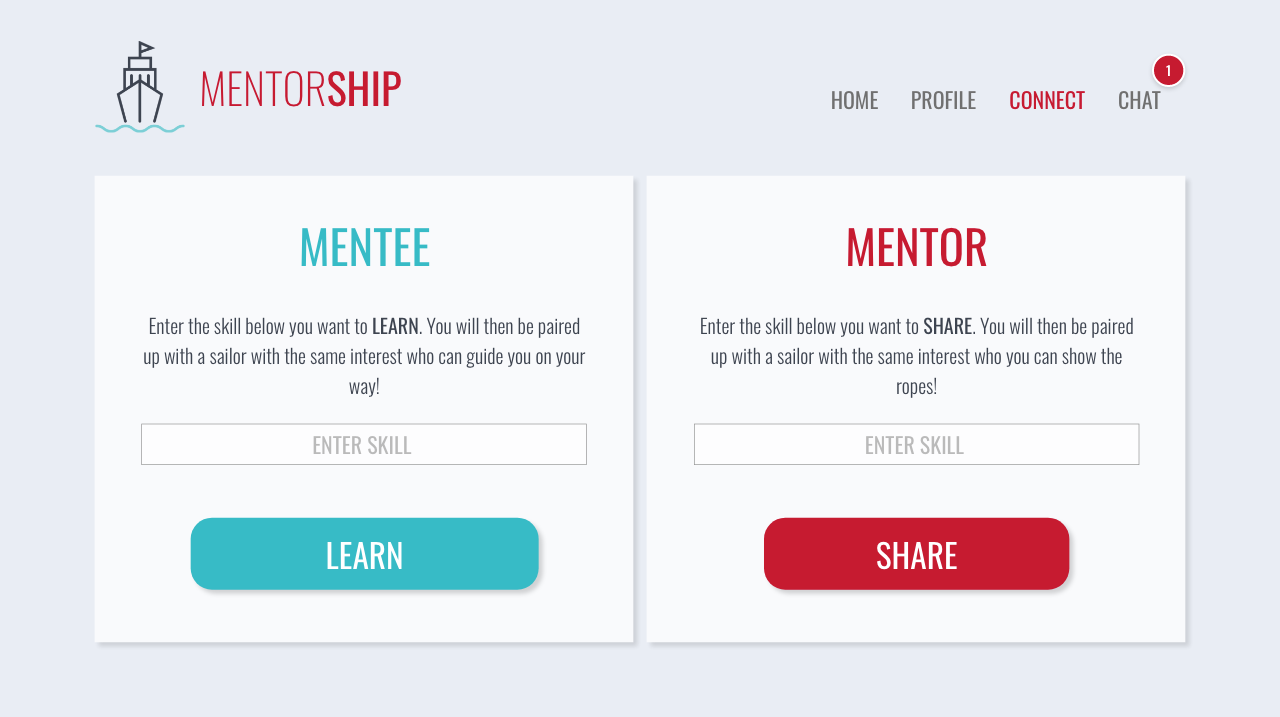
CONNECT SCREEN
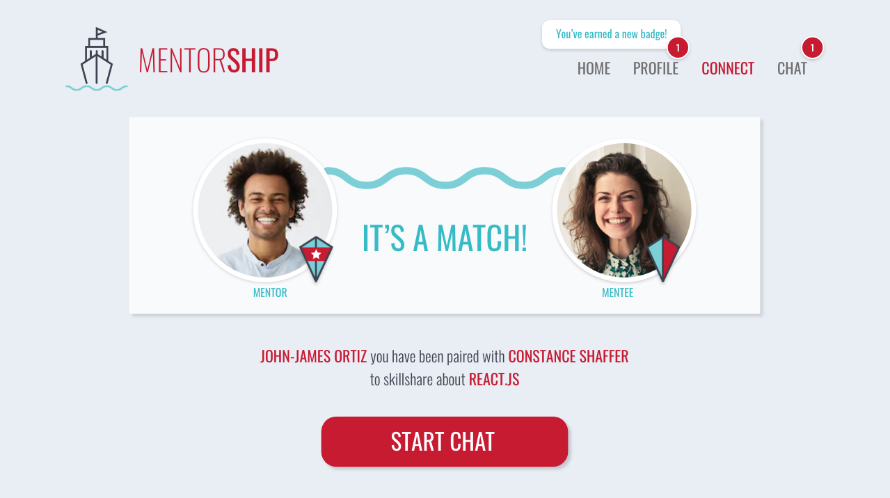
MATCH SCREEN
CHAT SCREEN
In designing the internal chat room screen, I included an options peek panel which allows tasks and goals to be set for the mentee by the mentor. It allows the user to view their progress and in turn this helps build their sense of achievement and confidence and wills them to use the application further through accountability.

CHAT SCREEN
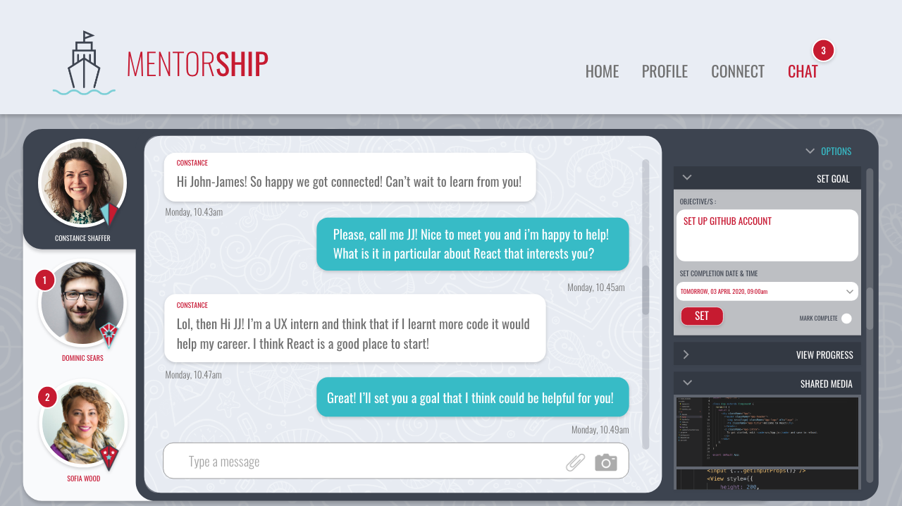
CHAT SCREEN - OPTIONS PANEL
3. SUSTAINABILITY
GAMIFICATION
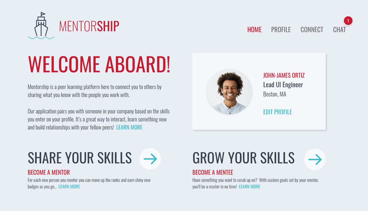
As an incentive for continued use of the product, I added a gamification element to the design. Users can move "up the ranks" with each new person they mentor, earning a new "badge" along the way. This is encouraging for the user as it shows their managers that they have initiative and community spirit. This can be beneficial for future promotions and career progression. I designed a “Question” page to explain to the user about this feature and this appears as an anchor link on the home screen.

BADGE SYSTEM - GAMIFICATION
EXPLANATION OF PRODUCT AND ITS USE - HOME PAGE ANCHOR LINK
As an incentive for someone to become a "mentee", the application allows for a non-judgmental environment in which people can learn something new from a peer in an easy going and relaxed way. As mentioned these subjects could be hobbies or work related which can also help the mentee's own career progression as it again shows initiative and a willingness to learn and build relationships with others in the company.
FUTURE DEVELOPMENT
As this is an ongoing project, I know that more challenges will appear as it evolves. The next main goal is to create a mobile version of the application that can be used on the go. I would also like to further reconsider consistency regarding CTAs across the application as a whole, as well as develop the chat screen options view for both mentee and mentor. I am enjoying the process of continuing the growth of this application.