
PRODUCT CONTEXT
A sushi train restaurant consists of colour coded plates, each with varying price points, passing by the customer on a belt or "train". The customer lifts a plate and eats it's contents. These plates are then stacked to the side of the table. The bill is primarily calculated by restaurant staff based on the number of coloured plates the customer has eaten. It is difficult for the customer to know the final price of their meal without keeping a list or using other applications such as their phone calculator or having a menu at hand for reference. From personal experience and from talking to others, I have found that this can cause stress for the customer, taking away from the enjoyment and spontaneity of the meal.

PRODUCT PREMISE
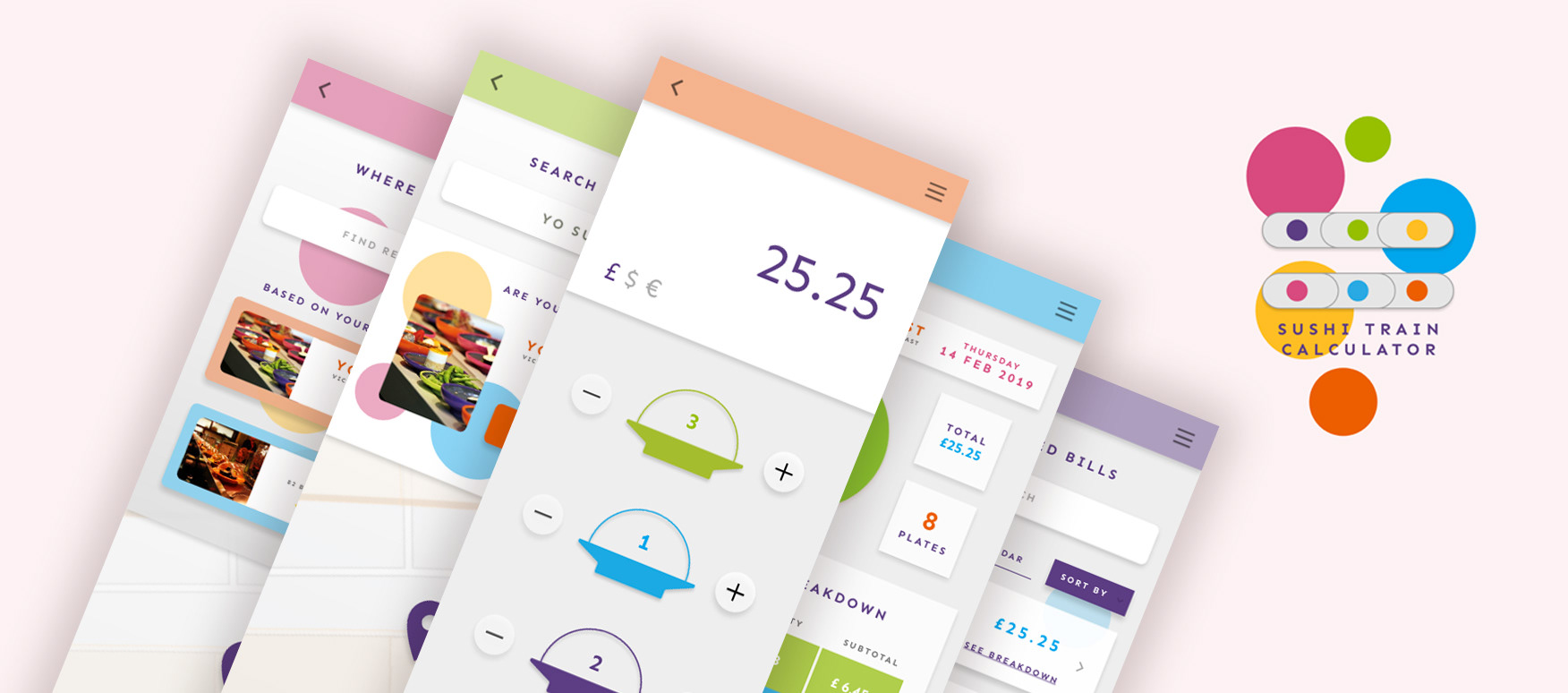
The Sushi Train Calculator enables the user to calculate and keep track of the total cost of their meal when visiting a restaurant. Users enter how many plates of each colour they have eaten and the application automatically calculates their bill in real time. It exists to help the user keep on top of their spending whilst also being enjoyable, easy and quick to use.

LOW FIDELITY WIREFRAME
HIGH FIDELITY MOCKUP
UX CHALLENGES & SOLUTIONS
PRIORITIES
I decided to focus on the application's functionality, speed and efficiency, as the conditions in which it might be used could be time sensitive and pressured. I thought about how I was going to keep the application clean and user friendly, whilst also fun and enjoyable for the user, who could as easily open their already existing calculator in their phone to use instead. I wanted to play with colour throughout the design adding fun, vibrancy and appeal to the application's overall aesthetic.
FUNCTIONALITY
A large design challenge I faced was how to organise the main "calculator" feature of the design. I knew I wanted the total to take up a large portion of the screen as that is the main purpose of the application and what the customer gains most value from. Therefore the biggest problem was how to organise the "plates" with such little screen real estate left to use. The amount of "plates" to be shown varies with each restaurant and so I thought about how to account for this in the design. I decided on a scrolling function, which is an easy and fast trigger system that the user would be familiar with. This left the most important element (the total) always fixed on the screen, allowing for the infinite plates to be shown below, without making the CTA's too small or appearing cluttered. I then placed further secondary buttons for other features below, such as "save" and "see breakdown".
MAIN FUNCTIONALITY
Add or remove items easily. Responsive icons, buttons and totals.
HUMAN ERROR
I added the function of being able to remove plates to allow for human error, as well as including an option to change the currency being calculated, to account for the user travelling to another country and another restaurant. The application will use data from the restaurants' menus to automatically know how much each colour of plate is worth depending on location.
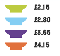
PLATES - AS THEY APPEAR ON MENU
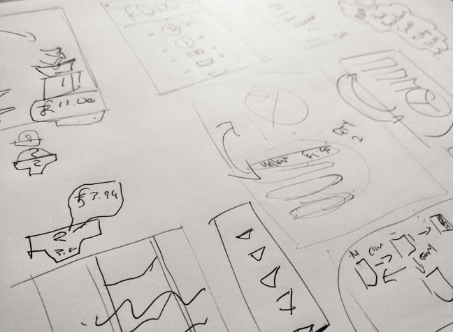
PRELIMINARY SKETCHES
ICON DESIGN
Another design challenge I faced was the appearance of the plate icons on the "calculator" screen.
I had initially thought of a circular plate design but realised that it could look too much like a CTA and confuse the user. Taking inspiration from the restaurant menus, I decided on a minimal icon which mimicked the side profile of the plates, including a casing which would house the number within, allowing for separation. I then used the corresponding colour of each plate to differentiate them from each other and I think this was a successful choice.
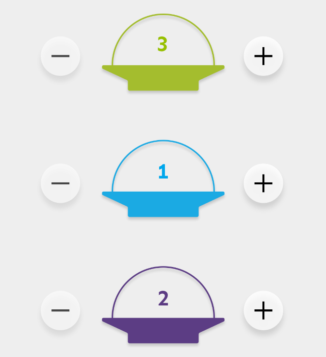
APPLICATION PLATE ICONS
MENU SCREENS
As time was of the essence with this design, I wanted to make the experience as easy as possible for the user. Once the application is opened, the initial screen remembers where the customer has been previously and with one click the user can go to their intended page which in most cases would be the main calculator screen. The user can also easily search for where they are and the application will use GPS to help them find their location.

MAIN LOGO SCREEN

RESTAURANT HISTORY
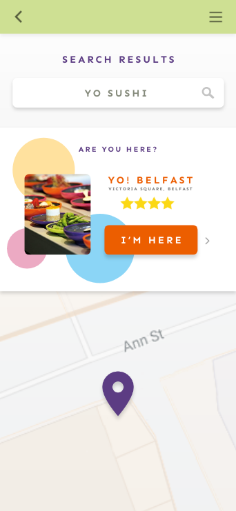
SEARCH RESULTS
BILL BREAKDOWN OPTION
Allows user to see patterns, favourite dishes and individual prices of plates.
SAVED BILLS
I added a function that allows the user to save their current bill for future reference. This function also allows the user to save the total of their plates as they go whilst they enjoy their meal.
The bill breakdown function allows users to see patterns of plates they have eaten and enables them to budget for future meals. This screen also shows the individual prices of plates.
The bill breakdown function allows users to see patterns of plates they have eaten and enables them to budget for future meals. This screen also shows the individual prices of plates.
All previous bills can be viewed on another screen, allowing the users to see past visits at certain restaurants and these can be organised by date of visit, total spent or restaurant, to remind the user of what they spent or ate the last time they were there.
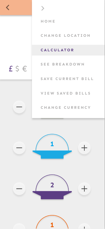
Each function that exists within the application can also be accessed via a burger menu on the side of the screen.
Each function that exists within the application can also be accessed via a burger menu on the side of the screen.
FUTURE DEVELOPMENT
I really enjoy the idea of incorporating an AI element to the design in future which allows users to uplaod a photograph of their plates to the application. The total could then be calculated via colour recognition, and appear on screen instantly.
RESPONSIVE LISTS
ACCESS TO FUNCTIONS VIA BURGER MENU